One drawback of working with spreadsheets is muddling through the data and trying to understand everything in confusing numbers and figures. The engineering team at Worksnaps have addressed this issue with a visual workaround, now available to all who are interested in fixing these problems of visualizing large amount of data. Worksnaps is excited to announce new reporting features to its existing suite of tools that are available to our clients. With these added reporting features, our clients are more easily able to keep up-to-date with their team’s performance and productivity.
CHART VIEW
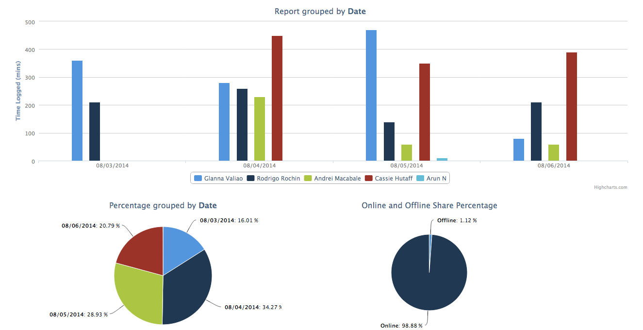
The chart view is altogether a different kind of animal. This next reporting feature lets you quickly assimilate your team’s or an individual’s activity through the use of easy to understand charts. While using this reporting feature, the client is simultaneously shown three graphs. Each graph contains three different types of information. The bar chart shows you every team member’s number of minutes logged. This chart helps you zero in on individuals and their performance. The next chart, a pie chart, combines all the information in the first bar chart and then unifies it. This helps you compare see the performance of your team as a whole. The last chart, also a pie chart, summarizes your team’s offline and online minutes.